
PLEASANT HEARTH
BRAND REDESIGN
Pleasant Hearth is a GHP Group brand that sells fireplace glass doors, electric fireplaces, wood burning stoves, fire pits and other products of a similar nature. The existing brand identity has become a bit outdated and fails to stand out on the shelves of some of our retailers.
For this ongoing project, I was asked to pitch a brand revamp that could provide a fresh, modern and youthful take. The goal was to make Pleasant Hearth more appealing to design conscious retail buyers, such as Target. For the first phase of the brand redesign, I decided focus primarily on the fire pit product category.
Scope:
Logo Redesign / Color & Type / Graphic Elements / Packaging
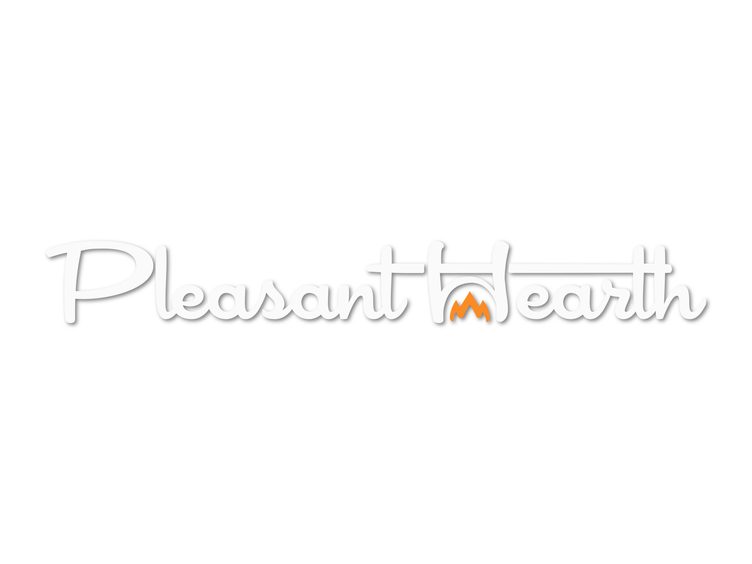
LOGO REDESIGN
For this redesign, I maintained some of the foundational features of the original logo as to not move away entirely from past branding efforts. Sticking with a cursive script, I chose a font that is clean, playful and legible. Additionally, I scrapped the literal interpretation of the hearth by creating an abstract representation that could be more closely integrated within the word mark.
OLD LOGO
▽
NEW LOGO
▼

COLOR & TYPE


GRAPHIC ELEMENTS


PACKAGING
Shortly before beginning this project, I had purchased a fire pit of my own. From the initial purchase, assembly and use, I was able to draw upon my own customer journey to pinpoint important design elements that could have influenced my purchase.
OUTSIDE THE BOX
The original packaging design was a bit overcrowded and lacked hierarchy. Therefore, I decided to go with a more minimalist design that places emphasis on the image of the fire pit itself.
OLD PACKAGING
▽
NEW PACKAGING
▼
The callout information from the original packaging seemed somewhat obligatory, and assumably would not influence a purchasing decision in one direction or the other. Most of it could actually be inferred from the image of the product, such as the “mesh cover helps keep sparks controlled.” I chose to give these callouts less significance in favor of information that I found more important.
I dedicated one of the panels entirely to assembly information, which we had included in our manuals but not on our packaging. The assembly of the fire pit that I had bought took about 2 hours. Had I known this, I would have likely opted for another product. By detailing the amount of time and energy required to transition from the initial purchase of the product to its actual use, the assembly time makes the product appear much more accessible.
INSIDE THE BOX
Inside the original packaging, all of the contents are wrapped in plastic for additional protection. For the redesigned concept, I proposed using paper instead of plastic. Not only is it a more environmentally sustainable option, it is also a key component in lighting a fire.
To start a fire, crumpled up paper is placed beneath the kindling and logs as a source of ignition. Therefore, the packing paper could serve two purposes:
Protecting the individual components
Providing tinder for the customer’s first fire
This feature would place the customer closer to their first time use of the fire pit, thus creating a more pleasant experience interacting with product from initial purchase to use.