THIN GLIZZY
BRAND IDENTITY
Opened in 2020 by local chef and Salumist, Chris Trevino, Thin Glizzy is an Indianapolis based popup restaurant serving handmade footlong hotdogs. Since its inception, Thin Glizzy has made a quick name for itself within the local food scene, hosting events with some of Indy’s most widely regarded restaurants, breweries, and charities.
Chris first approached me to design a single digital event poster for what he thought was going to be a onetime thing. However, several events later, it became clear that Thin Glizzy was here to stay. From that point, I was able to help Chris fine-tune his iconoclastic, postmodernist-punk sensibilities into an impressionable brand.
Scope:
Logo System / Color & Type / Digital Content
LOGO SYSTEM
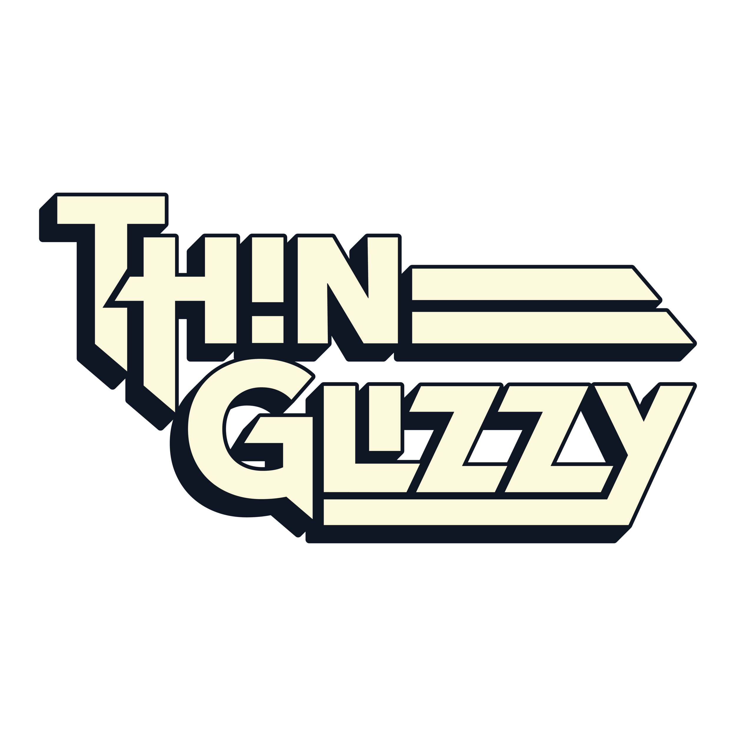
For this project, inspiration came from all corners. The name itself is a parody of the 1970’s rock band, Thin Lizzy, which set the foundation for the wordmark. From there, I drew from other assorted visual references, such as but not limited to: concert posters, comic books, late 50’s fast food Americana, and vintage Korean advertisements.

HORIZONTAL WORDMARK
STACKED WORDMARK

MONOGRAM LOGO

HANDMADE LOGO
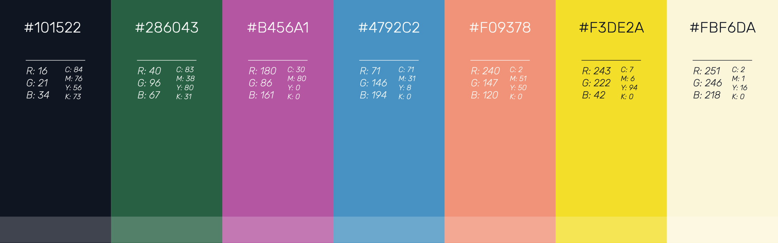
COLOR & TYPE

DIGITAL CONTENT
Thin Glizzy’s popup events diverge from your average dining experience. Often featuring live music, art exhibits, and waves of enthusiastic foodies, the events are every bit as eccentric and lively as the brand image itself.
For each of the events, I designed an advertisement to be spread across social media. To capture the excitement of the events, I used vivid colors and distinctive illustrations–similar to what might be found on a concert poster.