
THE LONELY MTN
BRAND IDENTITY
The Lonely Mtn is an Atlanta based purveyor of antiques and curiosities, founded in 2020 by my older brother, John. We have always shared similar interests and sensibilities, so when tasked with helping him create an identity for his brand that reflects that of his own, the direction was rather clear.
First and foremost, the brand had to pay homage to the literary influence of its name, The Hobbit. Additionally, I wanted to draw upon John’s passion for history to create a dynamic logo system, rooted in traditional merchant symbolism with a modern reimagination. In the end, I was able to create a visual identity for The Lonely Mtn that fits within its market while remaining true to my brother’s vision.
Scope:
Logo System / Color & Type / Print
LOGO SYSTEM
For this project, I went back in time a bit, using English merchant’s marks from the 13th-18th centuries as the base of my inspiration. They range in complexity, often circulating around a single geometric structure.

PRIMARY LOGO
There were three key elements I wanted to include in the logo from The Hobbit –the mountain (Lonely), the dragon (Smaug) and the hero (Bilbo).
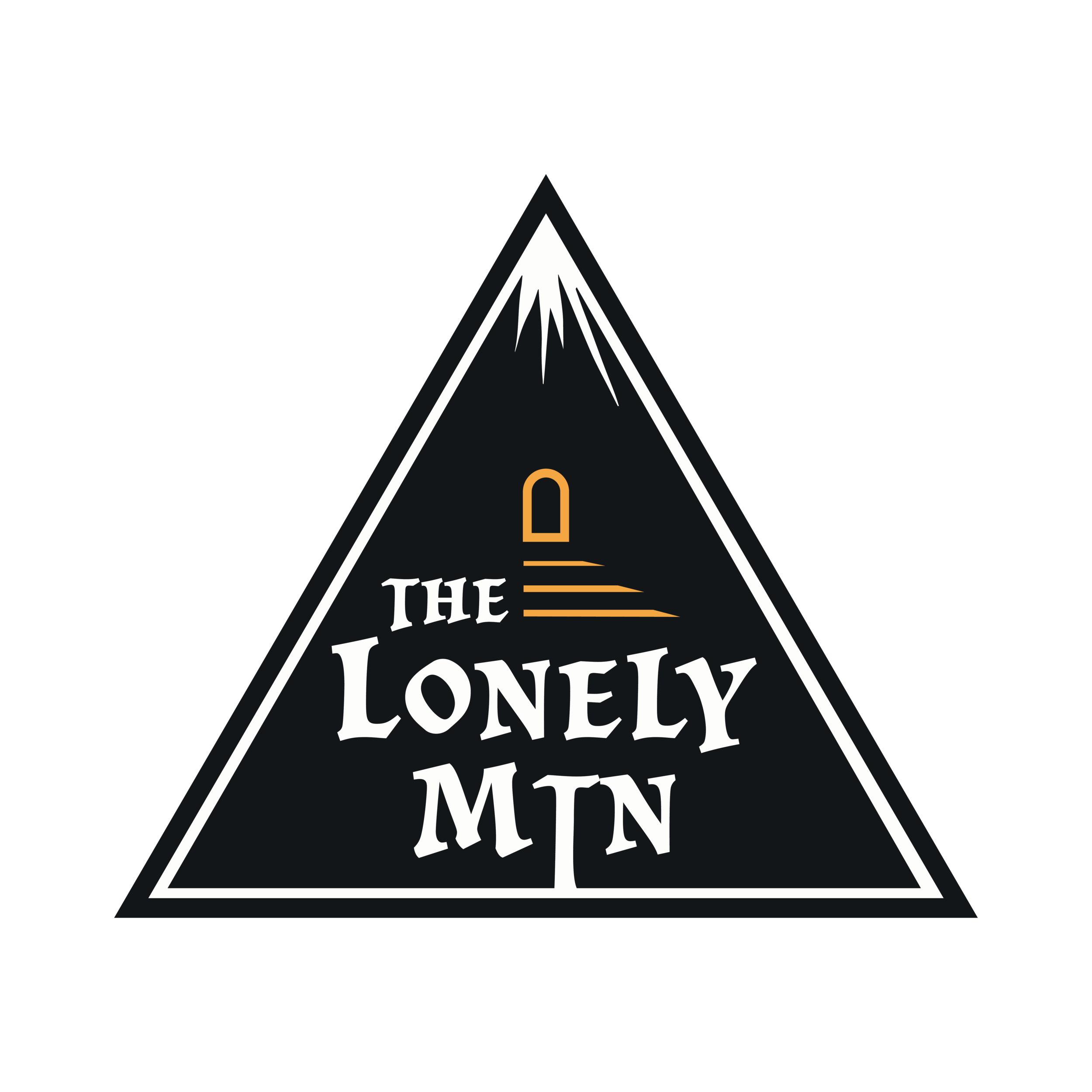
SECONDARY LOGO
I wanted to create something that was a bit more simplified to be used in situations where the complexity of the primary logo might be lost.

HERITAGE LOGO
With the primary logo’s focus on the dragon and the secondary logo’s focus on the mountain, it seemed only right that our hero would have his chance in the spotlight.
MONOGRAM LOGO
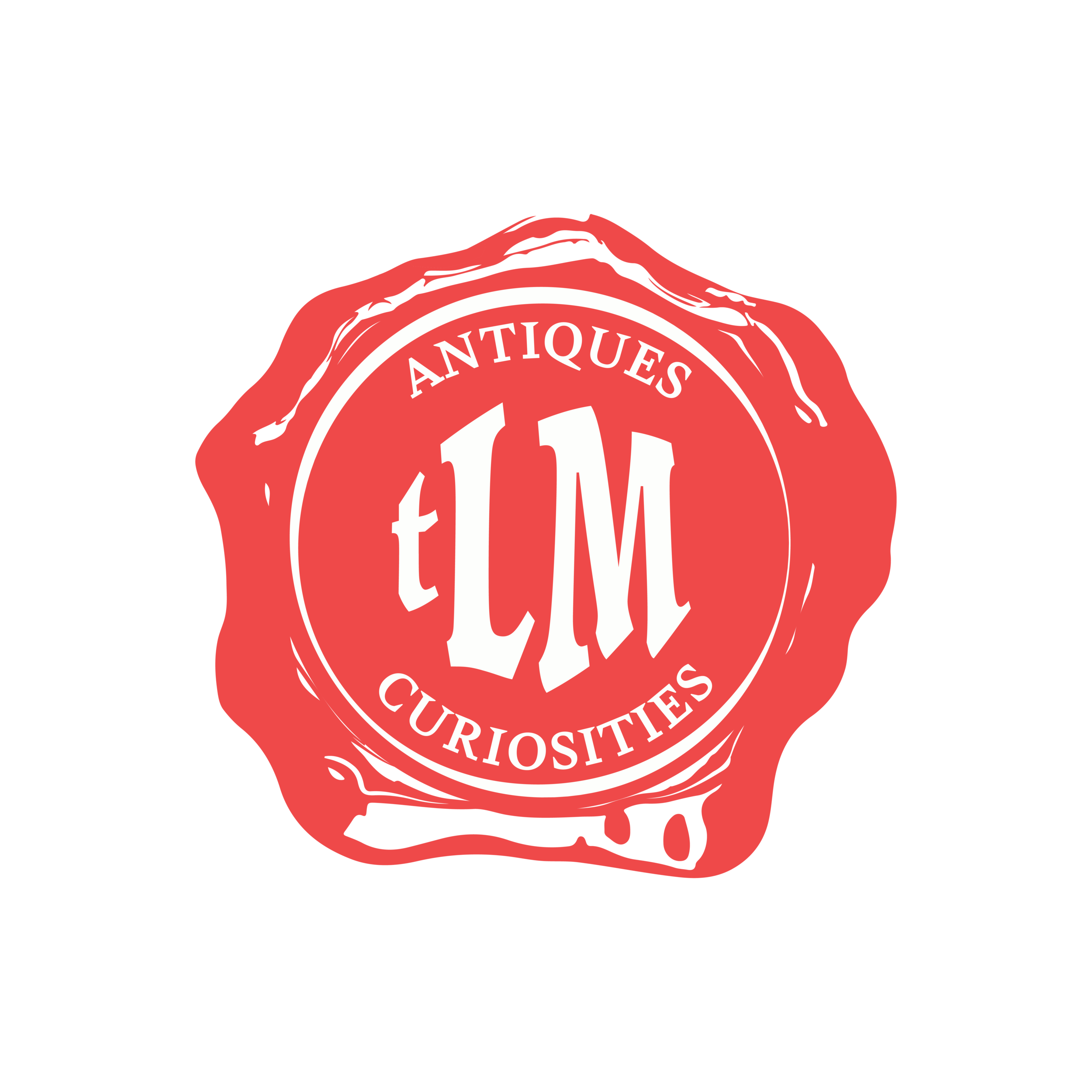
I created a wax seal monogram to be used primarily in print. Historically, wax seals were used to authenticate and show importance–and this logo serves to do the same.
COLOR & TYPE


Collateral
Product tag
Merchandise
Sign
